Charming Brutalism. An interview with Zupagrafika11 min read
Raw, unrefined, or, as Le Corbusier called it, béton brut. This concept paved the way for brutalism, an architectural movement that emerged during the 1950s in the United Kingdom. Brutalist buildings appear rustic and uncluttered, prioritising the functionality of the building itself and the needs of those who live in it.
A graphic design soup
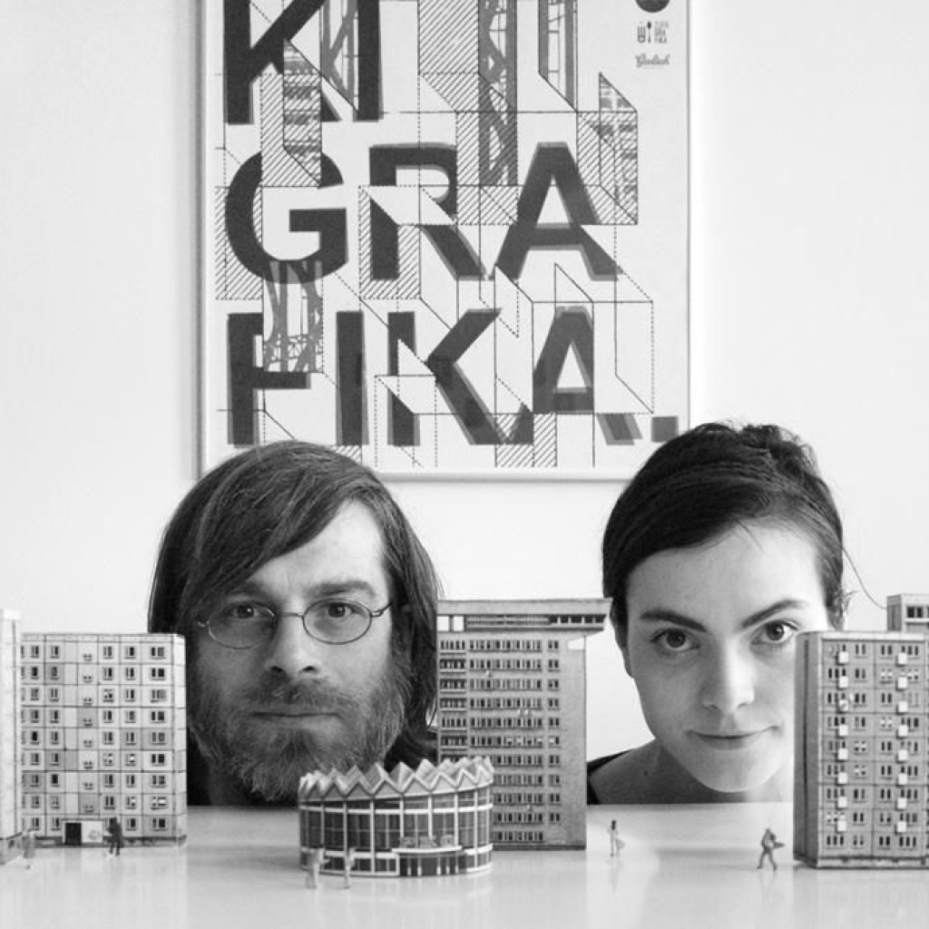
Zupa, soup, grafika, graphic design. Zupagrafika is a publishing house and independent design studio founded in 2012 by Martyna Sobecka and David Navarro in Poznań, Poland. David Navarro was a freelance graphic designer in Spain in the early 2000s, his passion for mid-century Polish graphic design and the Polish School of Posters resulted in starting Zupagrafika studio in Poland together with Martyna Sobecka. Their goal is to celebrate modernist architecture, design, and photography in a unique and entertaining way.
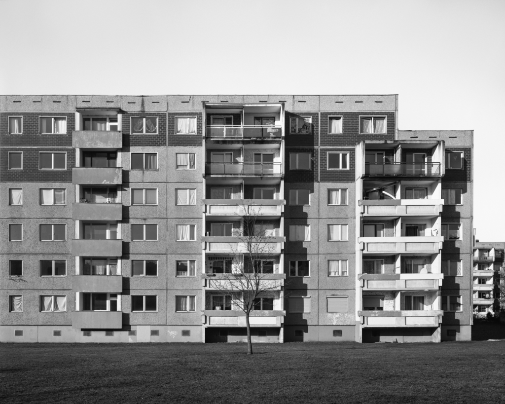
Their debut was Blokoshka in 2014, which was based on the concept of the matryoshka doll, but with an architectural and modernist twist. At the end of World War II, major European cities felt the need to provide their people with new, affordable living districts as quickly as possible. Blokoshka is thus presented as a tribute to Moscow’s “sleeping districts,” East Berlin’s Plattenbau, Warsaw’s large houses, and Prague’s panelák (colloquial term for “prefabricated building”).
Since then, Sobecka and Navarro have devoted themselves to the representation of brutalist buildings, their architectural line, and their inhabitants.
A chat with Zupagrafika
Your work focuses mostly on brutalist cityscapes, from the Eastern Bloc to Britain, France, Germany, and Italy. Let’s talk about the genesis of Zupagrafika: is there a meaning behind your brand name?
There is a game that is called “sopa de letras” in Spanish; it is a word puzzle that inspired the name of Zupagrafika. In our early days, as a graphic design studio, we would do typography-based projects, such as a lettering workshops or designing a prefabricated panel inspired font for one of the modernist housing estates in Poznań, Poland.
When did you decide that you wanted to realise this project and why? Were you struck by something or has this project always been a silent idea you decided to develop at some point?
We started Zupagrafika together after a freelance graphic designer experience, and we founded a design studio specialising in editorial design and graphic design applied to architecture. Simultaneously, we began to create and publish illustrated interactive books on Polish post-war modernist architecture in response to the rapid disappearance of this type of architecture that has been either demolished or thoughtlessly renovated. That was our way to preserve those buildings in their original form. We then launched follow ups in other countries.
Since we started Zupagrafika in 2012, we have been travelling, photographing, and illustrating post-war modernist and brutalist architecture in the former Eastern Bloc and Western Europe. The documentation of the districts and buildings that we visited during the last decade has been the main inspiration for the books we create and publish. Our publications include books on photography, illustration, and cardboard models.

What fascinates you most about brutalist architecture?
The architecture of the socialist era, or the “PRL” (The Polish People’s Republic), is still present in our everyday life. To this day, Polish cities are surrounded by huge, prefabricated panel block estates that are home to hundreds of thousands of city dwellers. Martyna was born in the mid-1980s, and like many people from this generation, was raised in a wielka płyta estate (prefabricated blocks of flats). You can see many different examples of this kind of prefab construction in our books. We admire the composition and design of those buildings and the architects behind them, and perceive them as peculiar pieces of art.
We perceive the brutalist and modernist buildings and complexes featured in our books as the anti-heroes of modern architecture. In particular, the housing estates might often be viewed as homogeneous grey masses of concrete, but rich diversity can be found in their design and urban planning. Many of those structures reflect the dreams and ideals of a controversial era. We try to portray them to help us better understand post-war Eastern Europe (and beyond), its dreams and utopias, failures and success.

In your book The Tenants (2022), you took portraits of Brutalist houses’ inhabitants and owners, interviewing them. These people are aware of living in brutalist houses in which some comforts are missing, yet they couldn’t think of “home” any differently. Was there any experience or story that moved you more than another?
After we finished each book containing paper models, we found great joy in photographing the models on location, in front of the buildings they represented. We would ask the inhabitants if we could take their portraits while they held models of their houses. We carefully listened to their stories, anecdotes about the communities they inhabited, thoughts on their blocks and the living conditions they offered.
The Tenants also celebrates the 10th anniversary of Zupagrafika and features over 40 housing projects in 37 different cities of the former Eastern Bloc and ex-Yugoslavia.
The quotes in the book are all interesting and each testimony is unique. However, there is one that really struck us as unusual by Tatyana from Riga, Latvia, who speaks about her district Pļavnieki: “I have lived here for 30 years. I used to work in a factory that produced those panels. Turns out that I built a house for myself.”
Through the journey leading up to the publication of this volume, we learned a lot from the people whose everyday lives revolve around the ‘sleeping districts.’ It was gripping to discover how uniform their feelings were about the estates they inhabit across this vast area under study. From the former East Germany to Siberia, and all the way through Kazakhstan to the Baltic states, the inhabitants would unanimously praise the large green spaces, children’s playgrounds, and public transport, and frequently complain about the technical state of the buildings, such as poor thermal insulation or maintenance.
Your books not only focus on the Eastern Bloc: Paris Brut (2016), Brutal London (2016, Prestel), Brutal Britain (2018) and now Brutalia (2023) about Italy. As far as culture, society, and politics are concerned, did you notice any differences in the role of architecture in Italy from that in the Eastern Bloc?
There is a common preconception about post-war modernist and brutalist architecture, especially the housing estates. At first glance, the blocks of flats seem to be identical everywhere you go, from Moscow to East Berlin. But if you look a bit closer, you will see these standardised typologies have their own unique character in every single country. In fact, most of the housing projects designed to be copied and pasted all around the former Eastern Bloc were locally modified and adjusted to every region’s/town’s/country’s needs. There is huge diversity to be found in architectural structures from this period, the otherworldly concrete grand designs born in the former USSR being the best case in point. Just look at the cosmic shapes that were created out of steel and concrete in the past era.
Even more diversity can be found in the UK, France, or Italy. Modernist style started by Le Corbusier was practised in western Europe already in the 1930s, but after WWII it started to develop on a mass scale for the same reasons as it did behind the Iron Curtain. Modernist ideas of collective living and minimalist functional design were of course perfectly suited for communal needs, but they also turned out to be the best response to the new reality where all European governments needed to address the same housing shortage and provide quick and cheap flats for the masses.
Is there a city you enjoyed the most?
We honestly enjoy every city and town we work in. However, we do not photograph big urban centres only. Indeed, some of our projects, like The Tenants, Monotowns, or Soviet Playgrounds feature small towns or even villages where prefab panels and modernist industrial design are also very present. Perhaps these are the most thrilling discoveries when we find an interesting building or piece of playground equipment in “the middle of nowhere.”

Architecture is a big part of everyone’s life and Brutalism has an impact on people’s mindset living in Brutalist-structured spaces. Not architecture only, but also graphic posters and posters between the 50s and the 80s. What effect do you think this art created on the society of the time?
During the post-war period in Poland (The Polish People’s Republic at that time), graphic designers enjoyed great creative freedom. They could practise the most sophisticated but also minimalist or highly abstract ways of expression, creating posters for the masses that became real pieces of art and gained a considerable historical value as the Polish School of Posters. All this was possible because cinemas and theatres were always packed with spectators in the era of scarcity of repertoire, so posters did not really play a crucial, if any, role in promoting anything. We have recently published a book that pays homage to the Polish Poster artists of this era called Słup: The Polish Poster Column. The book allows readers to assemble their own advertising column with mini posters and detach larger sizes to frame and hang on the wall, while learning more about the history of the Polish Poster School.
In addition to cityscapes, you also gave us a better picture of children’s everyday life in Soviet Playgrounds (2022) that had a great impact on children and young adults at the time. What are your thoughts on this?
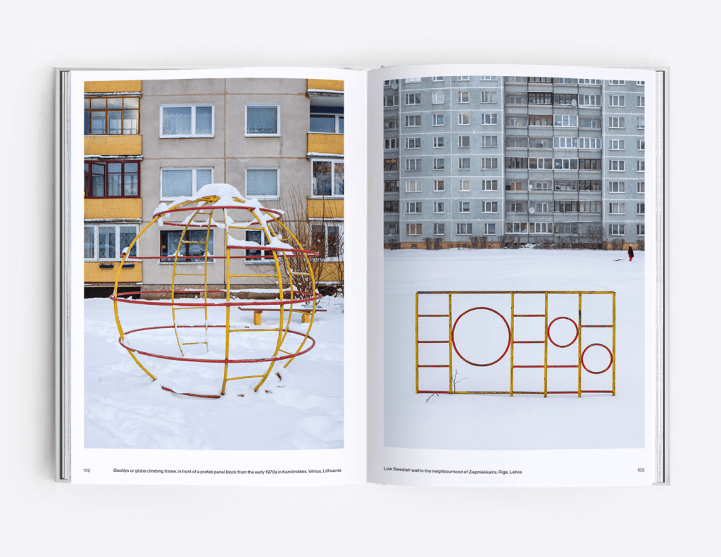
Soviet Playgrounds reflected the highlights of the reality in the former USSR. Many of the cosmos-inspired objects you will find in this book were installed during the Cold War-era space race. It was the time when every child wanted to be like Yuri Gagarin, the first man on the moon, and so local governments would start a massive production of rocket slides so that every child could feel like an astronaut themselves. Of course, the upbringing of the new generation of Soviet citizens was a very important part of cultivating communist ideology in a society, and through such thematic equipment children were encouraged to cherish the patriotic spirit collectively.
Soviet Playgrounds is a photographic survey of Soviet-era playgrounds found in former members of the USSR, such as Ukraine, Lithuania, Latvia, Estonia, Russia, Belarus, Kazakhstan, Tajikistan, and Uzbekistan. Through five chapters containing more than 150 photographs, the book documents the mass-produced, yet diverse, play equipment installed in the communal spaces of socialist-era housing estates, such as rocket slides and earth-shaped climbers, spaceships and animal-themed ladders, cosmic roundabouts and bizarre objects that would probably raise safety concerns nowadays. From Riga to Dushanbe and all the way from Kyiv to Vladivostok, children dreamt of becoming cosmonauts, and enjoyed the many space-themed playscapes which had proliferated since the onset of the Cold War era. While some are still in use, others are slowly disappearing to make way for modern equipment, or, more recently, being destroyed during the Russian invasion of Ukraine, becoming only a faint memory of a Soviet childhood.

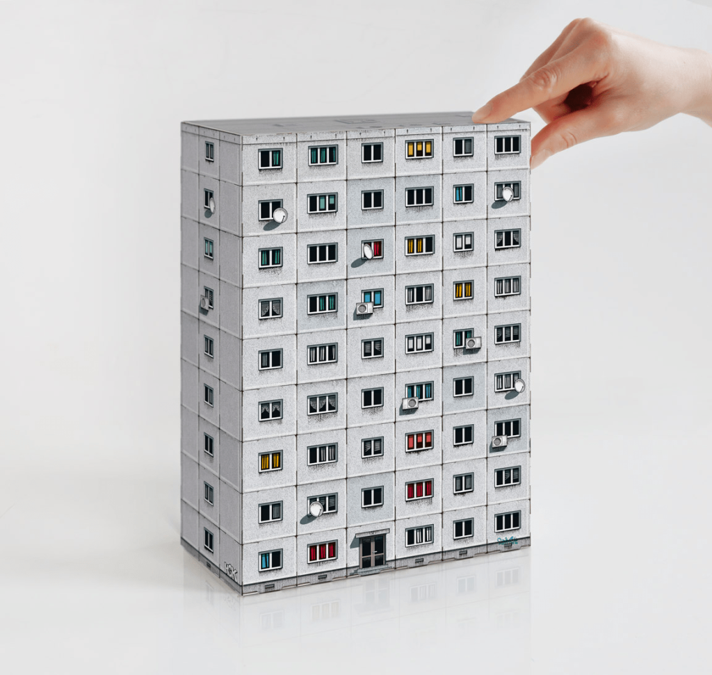
Lots of your books — Blok Wschodni (2014), Brutal London (2016), Brutal Britain (2018), Panelki (2019), Brutal Poland (2020), Brutal East II (2021) and Brutalia (2023) and many more — give the readers the chance to have fun assembling their own Brutalist building. This allows your readers to get to know the buildings and to have a concrete experience. What’s the story behind your paper cut out models? What kind of message would you like to convey with your models?
Rather than having a message to convey, our books are a way of creating an archive or documentation of what we see. We started to create and publish illustrated interactive books on Polish post-war modernist architecture in response to a rapid disappearance of this type of architecture that has been either demolished or thoughtlessly renovated. That was our way to preserve those buildings in their original form. We have worked out a very detailed style of illustration to display the original facades of the buildings as they were constructed, while also featuring all kinds of peculiarities present on their facades as a result of the passing of time or human intervention — like TV antennas, window curtains, graffiti, or patches of dirt.
Is there a Zupagrafika project that you loved the most and that you consider to have expressed the soul of your project at its best?
Each new project and publication are special for us, we don’t have a favourite one honestly.
Talking about your gear, do you have a favourite lens or technique (aperture, depth of field, wide angle) that in your opinion helps to better convey the brutalist atmosphere?
We like to travel relatively light. A DSLR camera and two lenses, a 15-35 and a 24-70. It depends on the object, but we generally shoot at apertures between f-8 and f-10 and try to avoid direct sun in the composition as it usually creates hues and contrasts that we are not interested in.
Last, but not least, we are super fans of your work; hence we are extremely curious about your next projects. Do you have any books in the pipeline for the near future? Can you give us some preview or reveal anything to us?
We continue to explore different angles of post-war modernist architecture, travelling and photographing in all corners of the world. A publication on the architecture of Hong Kong is our next title to come out this year.
This article was originally published in Italian on 02 June 2023 by our partner Meridiano 13.
Images: Zupagrafika


